
UX / Product Design
Yelp
Make Yelp a place worth coming back to.
A concept redesign of Yelp’s mobile app, made with a five-person team at Design Innovation Illinois. I led the team as design lead, from research to the final screens.
Student concept, not affiliated with Yelp
- My Role
- Design Lead
- Team
- Sebastian, Ryan, Jordan, Sara & Riddhima
- Timeline
- January – May 2026
- Tools
 Figma

Overview
The Problem
Yelp’s monthly app users fell from 33 million to 29 million between 2022 and 2024. Finding a place takes too much scrolling, people doubt whether reviews are real, and there’s no community to keep them coming back.
The Redesign
Five tabs, each with one job: Home, Explore, Create, Map and Profile. Friends and trusted reviewers come first, search and filters get faster, and the map becomes a place to discover, not just a list of pins.
My Role
I was design lead for a five-person team. I set our three checkpoints, split the app into sections across the team and kept the screens consistent from research to the final prototype. I designed the Home tab myself: the feed, highlights, messages and the AI assistant.
Process
From research to a new structure, wireframes, an A/B test and final screens.
-
Research
Find Why People Leave.
We mapped pain points in the current app: ads and sponsored posts, a bland interface, settings and support hidden away, no personalized recommendations, and no way to tell if a reviewer actually visited.
Then we scored five apps people use to find places, and interviewed people with questions in seven groups: search and discovery, social features, UI and navigation, reviews, customer support, maps, and customization.
Five apps people use to find places, scored out of 5. Feature Google Beli TripAdvisor TikTok Trustpilot UI & navigation 5 4 4 4 4 Visual design & branding 5 4 5 4.5 4 Key features 4.6 3 4 3.5 3.5 Reviews & feedback 4.25 3.5 4 5 4 Customer support 5 4.5 3 5 3 Personalization 4 4.5 3 4.5 2 Overall 4.65 3.92 3.83 4.42 3.42 Five apps people use to find places, scored out of 5. Green is strong (4 to 5), yellow is okay (3 to 3.9), red is weak (below 3). -
Synthesis
Three Insights, One Objective.
We wrote down what people told us, then affinity-mapped it to find what kept coming up. Three insights became the base of the redesign.
-
UI & Navigation
Navigation
Key insightPeople want to find and filter relevant places fast, not sift through cluttered layouts and irrelevant results.
-
Social Features
Social
Key insightPeople want recommendations from friends and trusted communities, not anonymous strangers with no context.
-
Reviews / Feedback
Reviews
Key insightPeople want to trust that ratings are genuine and recent, instead of second-guessing reviews that may be fake or outdated.
-
Ads
Sponsored listings look like real results and clutter the page.
-
Details
Long reviews skip what matters: wait time, price, portions and allergy info.
-
Business owners
Owners can’t see how reviews get filtered, or how best to respond.
Four personas, a high-school athlete who travels for games, a college student who picks the spot for his friends, a retiree new to town and a local business owner, each got a journey map that kept the insights tied to real situations.
Overall Objective
How might we streamline the Yelp experience so that discovery, trust and community make it feel like a place worth coming back to?
-
-
Direction
Five Tabs, Each With One Job.
The current app splits tasks across Search, Projects, Assistant, Collections and Me, and keeps contributions, community and settings in one long list. The new structure gives each task a predictable home, adds a tab for creating, and turns the map into its own destination.
Before
- Search
- Quick search options
- Search bar
- Recommended
- Recent local reviews
- Projects
- Categories
- Start project
- Recommended
- Assistant
- AI chat
- Collections
- Featured
- My collections
- Following
- Me
- Notifications / share
- Add review / photo
- Recently viewed
- Contributions
- Community
- Activity
- Account
AfterNew tab
- Home
- Stories
- Reviews
- Messages
- Trending spots
- AI assistant
- Explore
- Search spots
- Filters
- Location review
- Compare
- Create
- Review
- Story
- Thread
- Map
- Discover
- Map layers
- Search
- Filters
- Profile
- Profile header
- My contributions
- My settings
- My history
- Support
- Account settings
Before: Five Tabs With Overlapping Jobs. After: Five Tabs, With New Create and Map Tabs. - Search
-
Wireframes
Draft Every Tab in Mid-Fidelity.
For our second checkpoint, each of us wireframed our tab in grayscale before adding any color: a home feed of highlights and reviews, the AI assistant, a map you can open anytime, and a profile with history and contributions grouped.
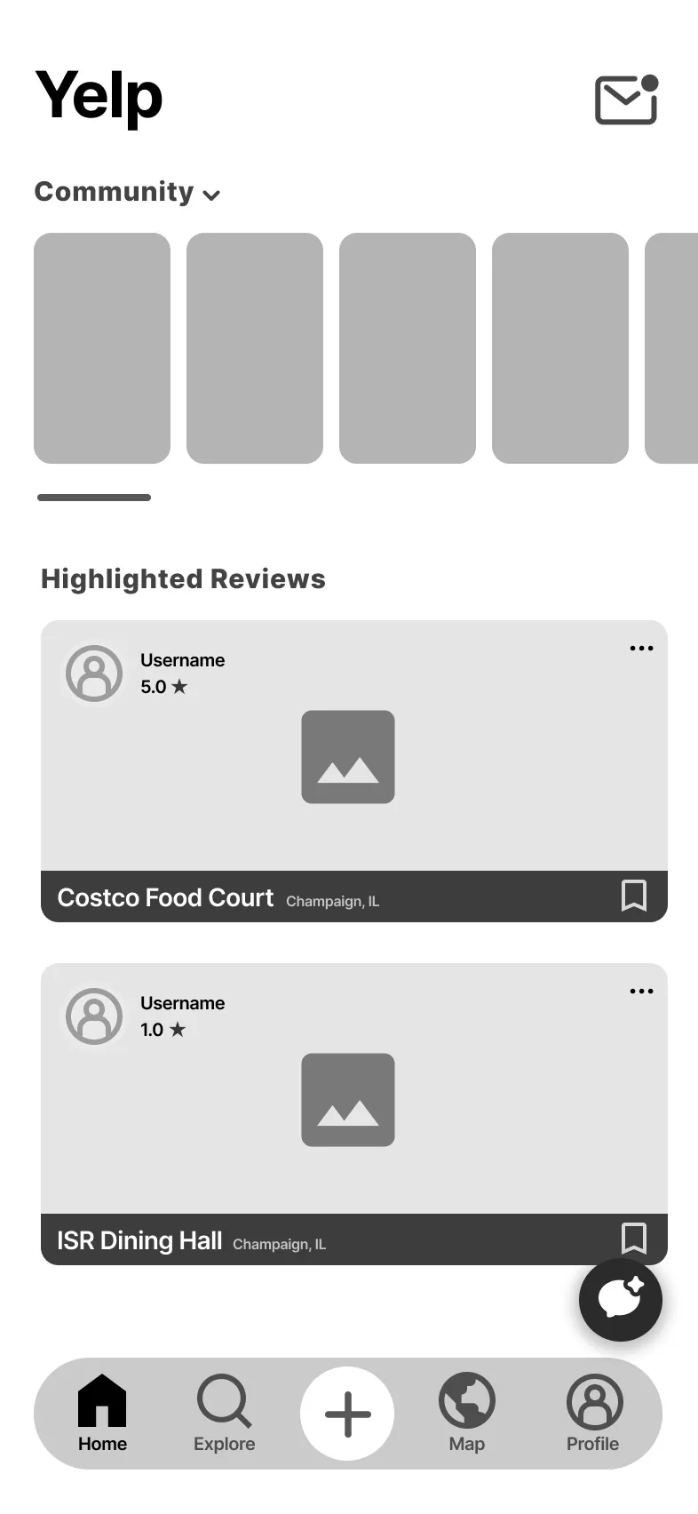
Home 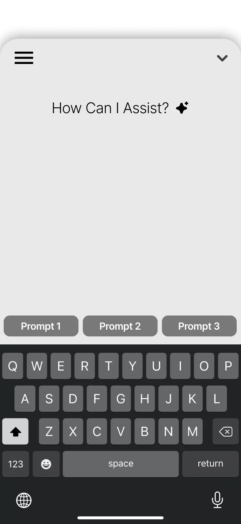
AI Chat 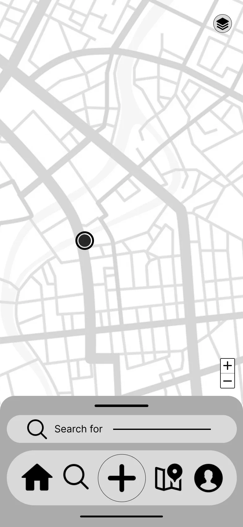
Map 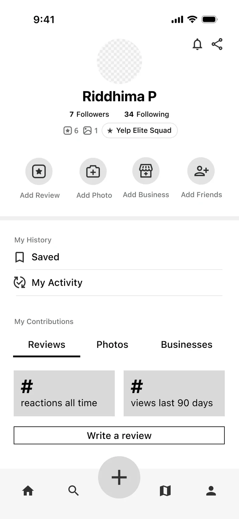
Profile Mid-fidelity wireframes from our second checkpoint. -
A/B Testing
Test How People Leave the Map.
Once the map became its own tab, getting back out of it had to feel natural. We compared five versions: keeping the navbar, an X button, a back button, and two with search at the bottom.
We carried the version that keeps the navbar into the final design.
-
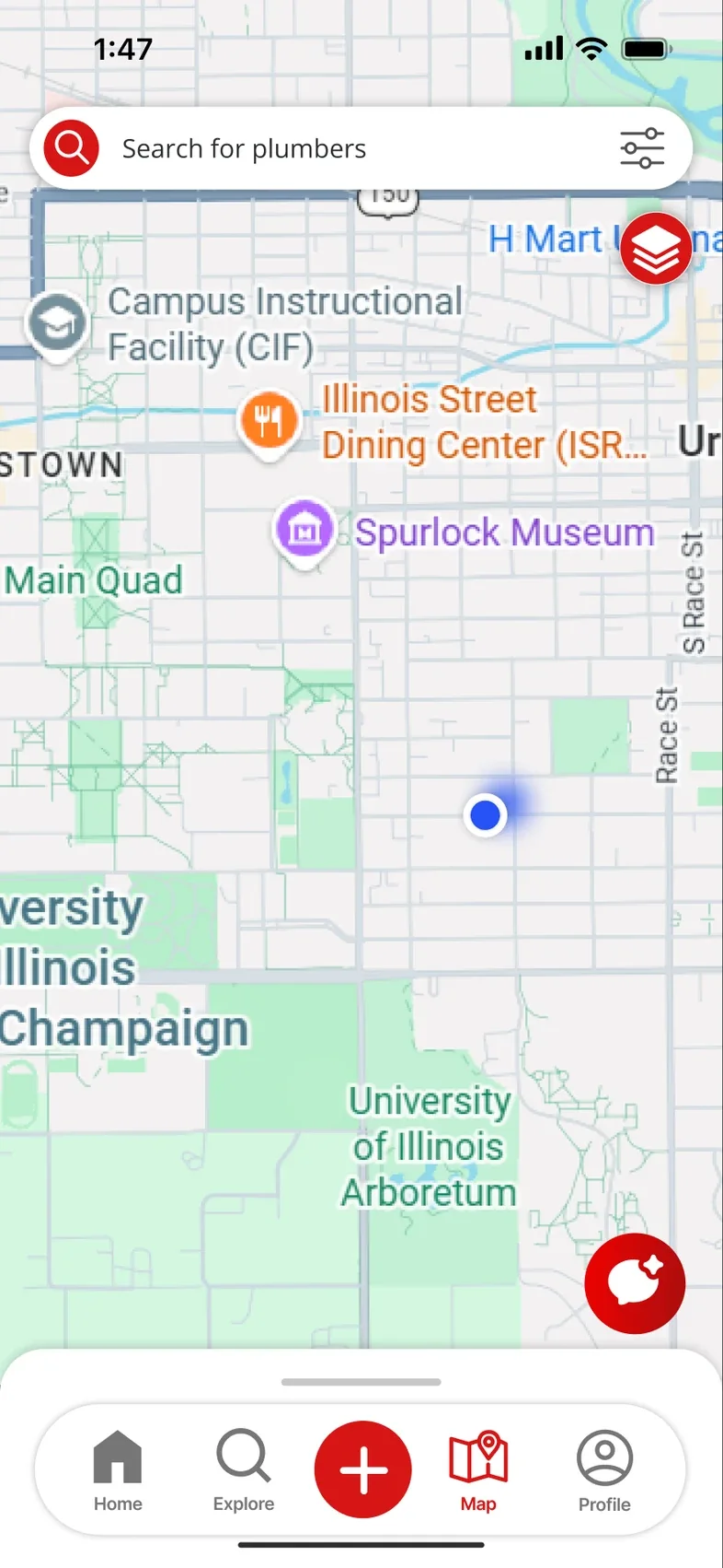
Navbar PresentChosen
The five tabs stay at the bottom, so every part of the app is one tap away.
-
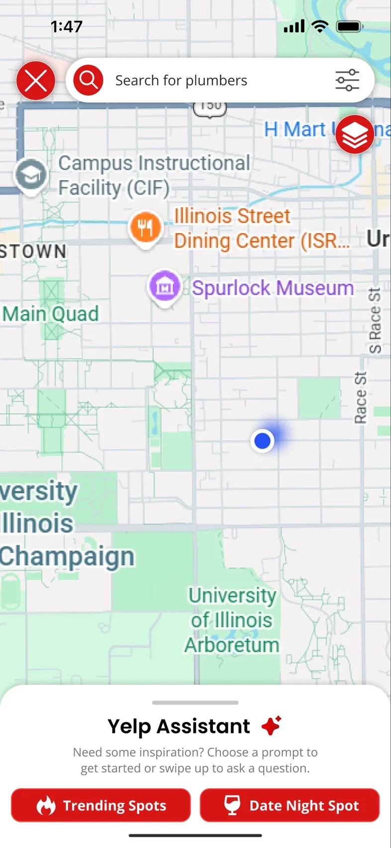
X Button
The tabs hide for a full-screen map, and an X in the corner closes it.
-
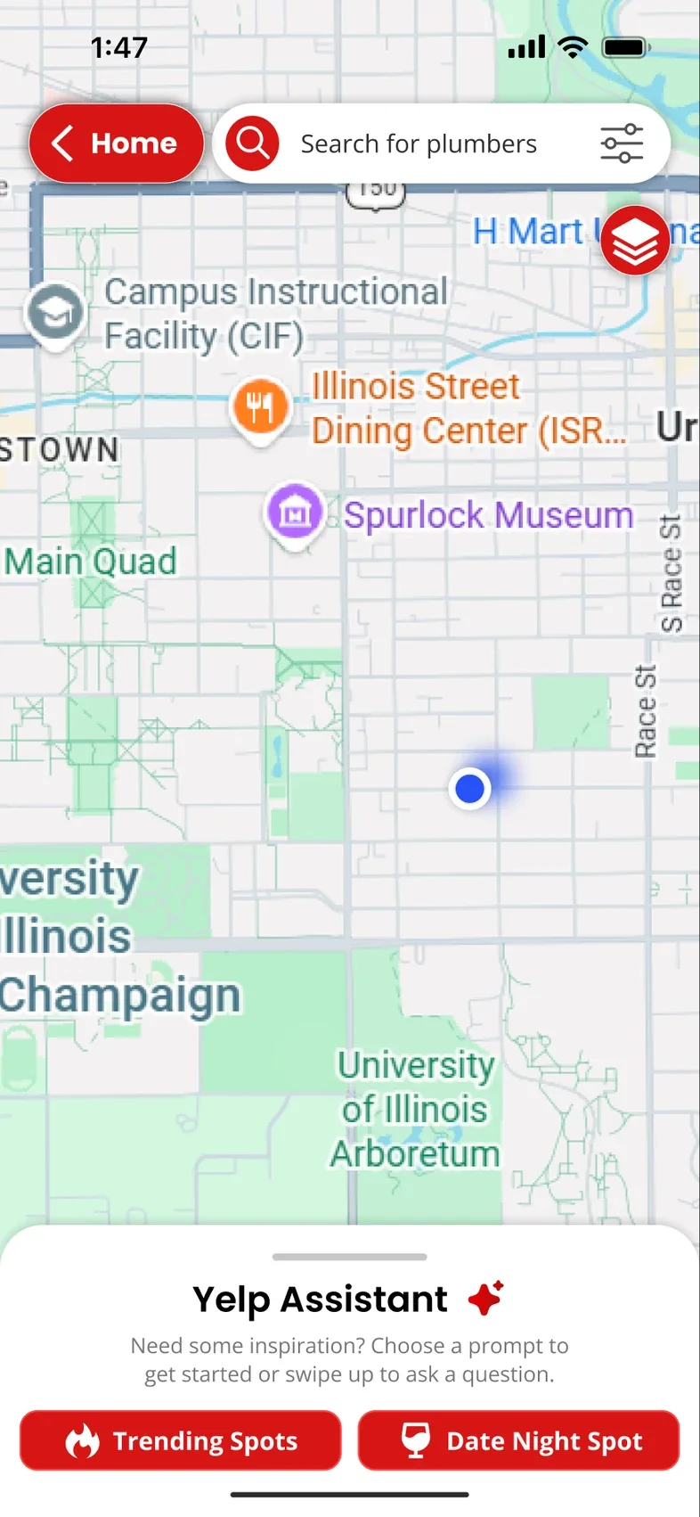
Back Button
The same full-screen map, with a labeled Home button to leave.
-
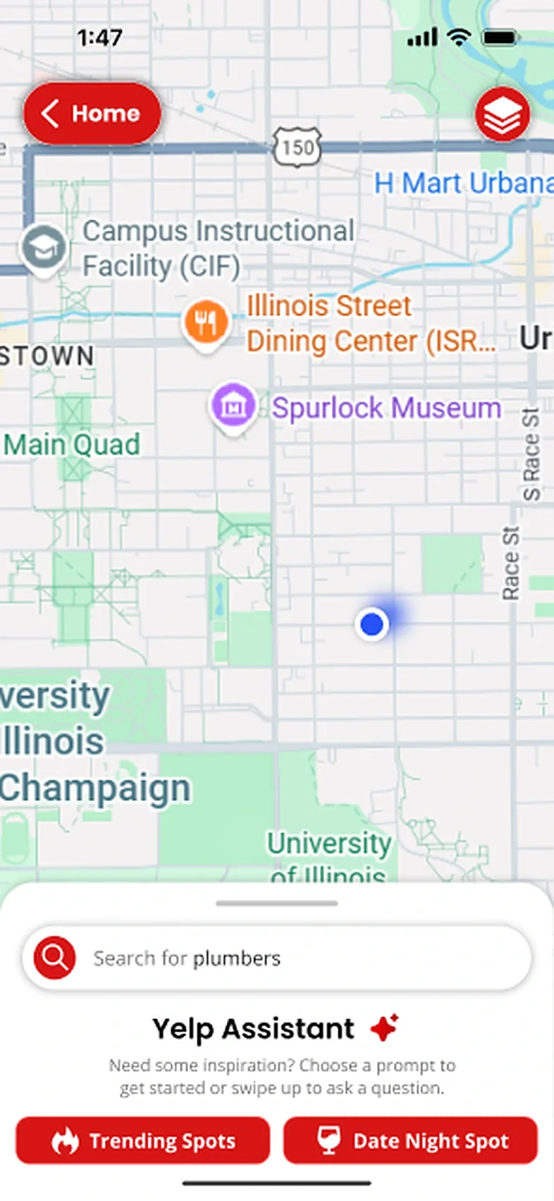
Bottom Search 1
Search moves down into the bottom sheet, within reach of your thumb.
-
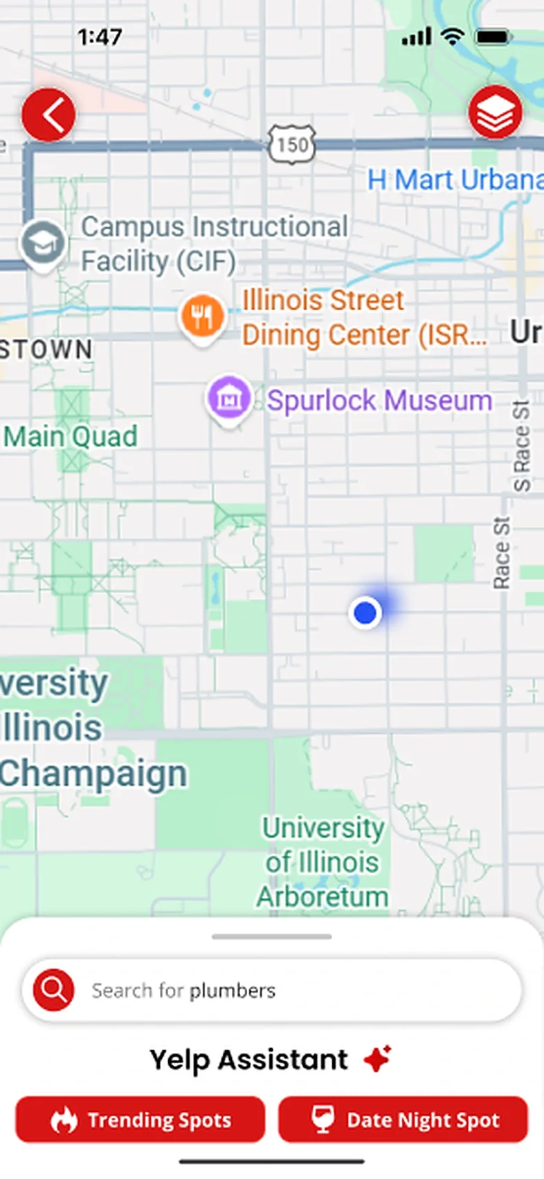
Bottom Search 2
Bottom search again, with a smaller back arrow and a slimmer sheet.
Five ways back from the map. We kept the navbar. -
Final Design
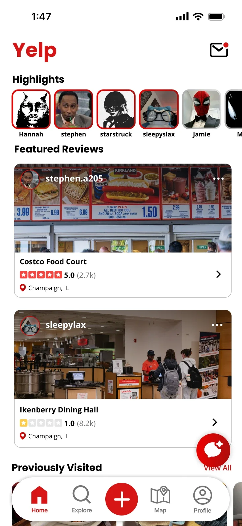
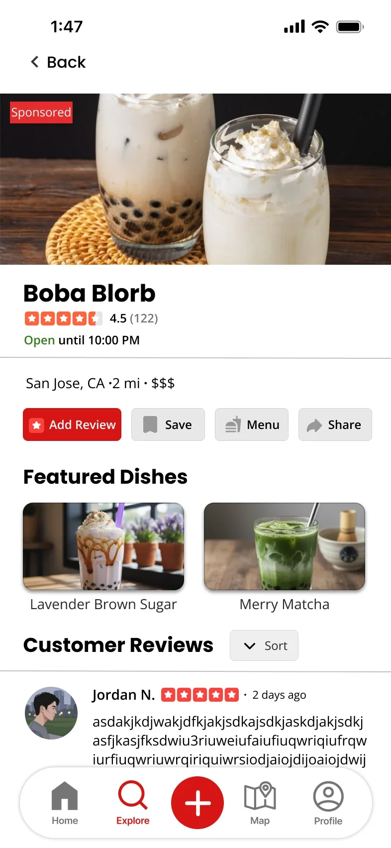
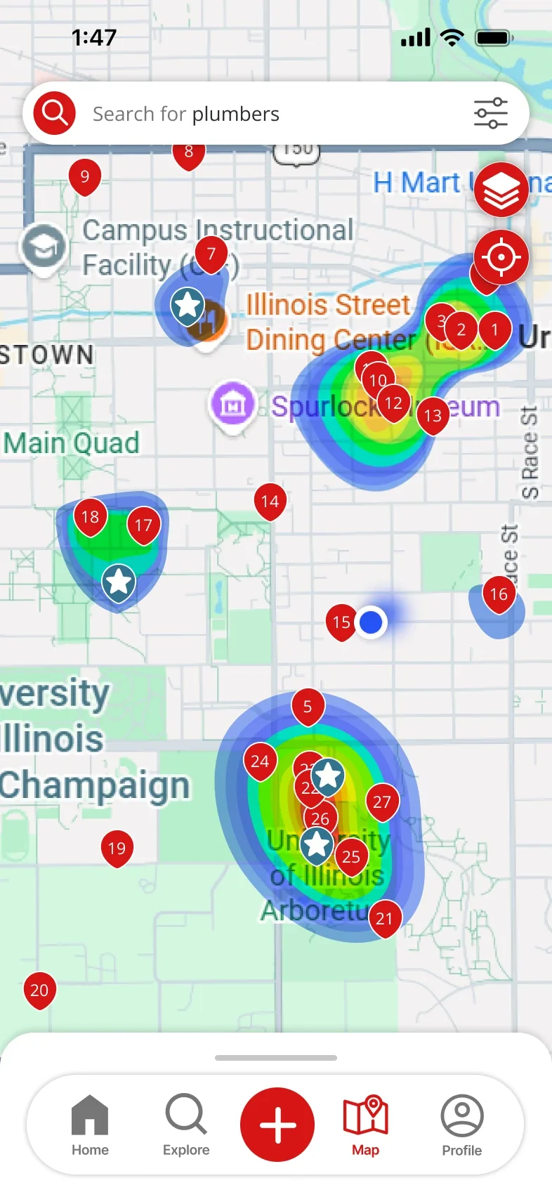
The finished app: a social home feed, a business page built for deciding and a map to explore.
Screen 1 of 3
Put People Before Ads
Home leads with highlights from friends and featured reviews, not sponsored posts.
Keep Deciding Details Together
Rating, price, distance and featured dishes sit together on every result and business page.
Before & After
How each part of the app changed, across the whole team’s redesign.
-
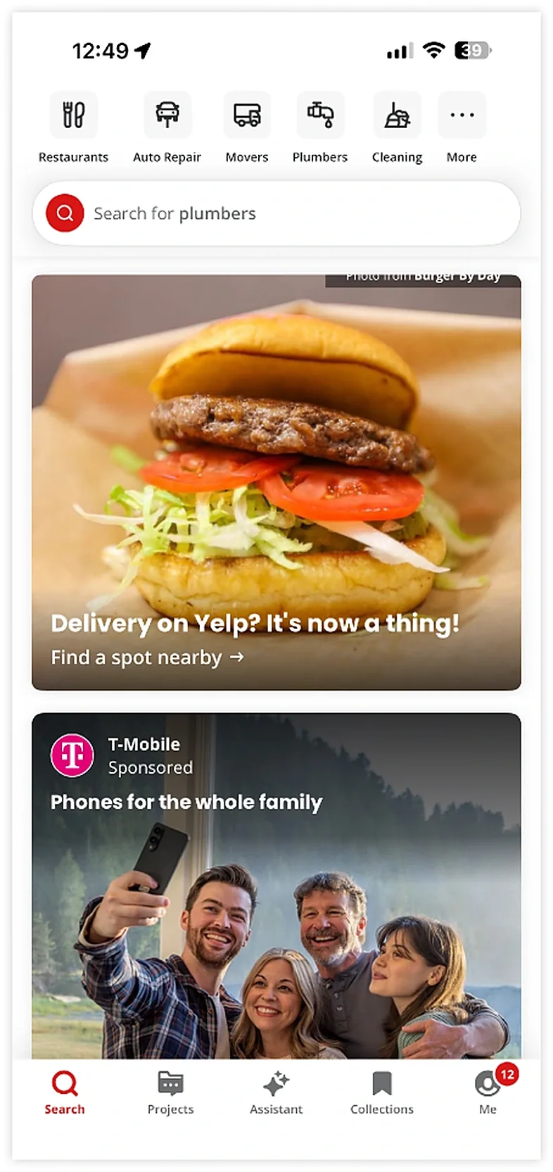
Current
Updated Home 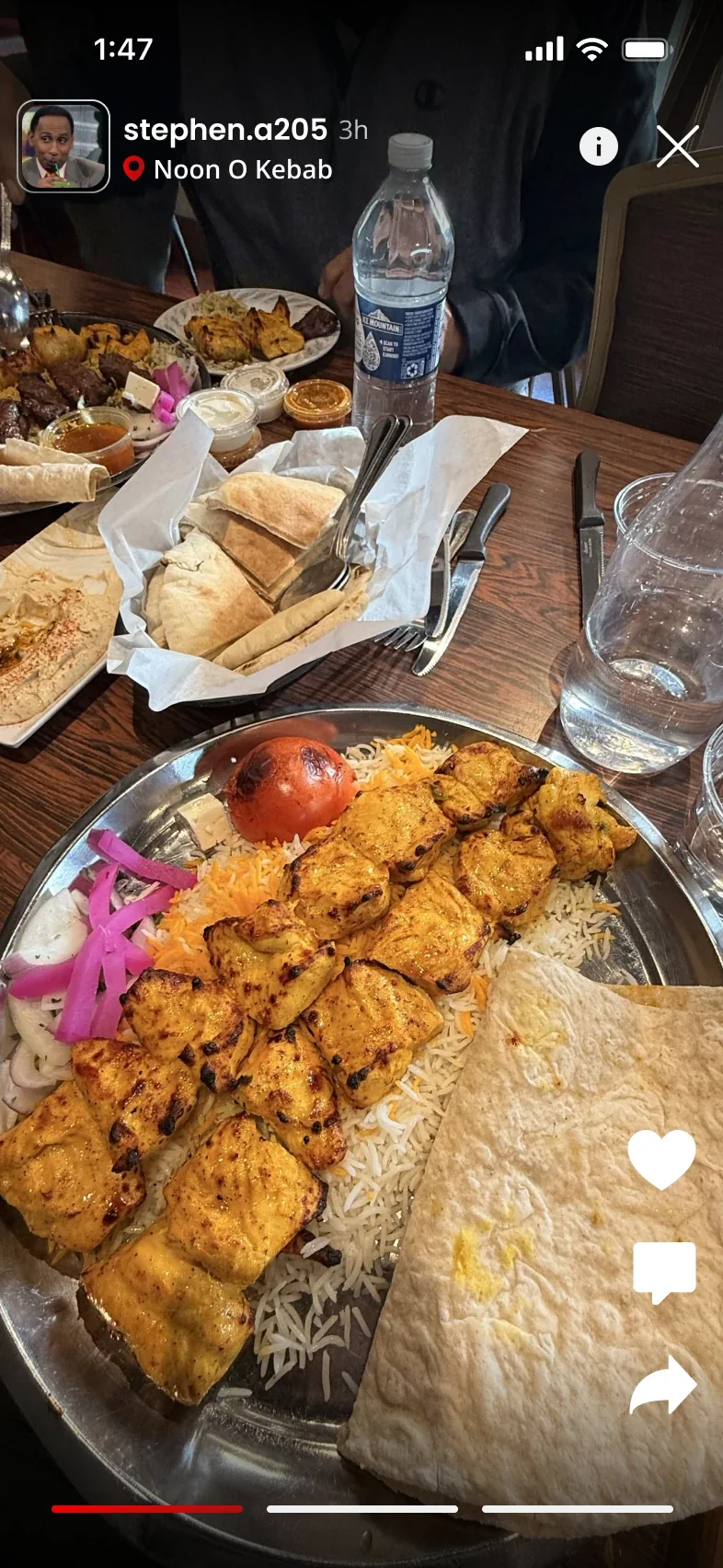
Highlights 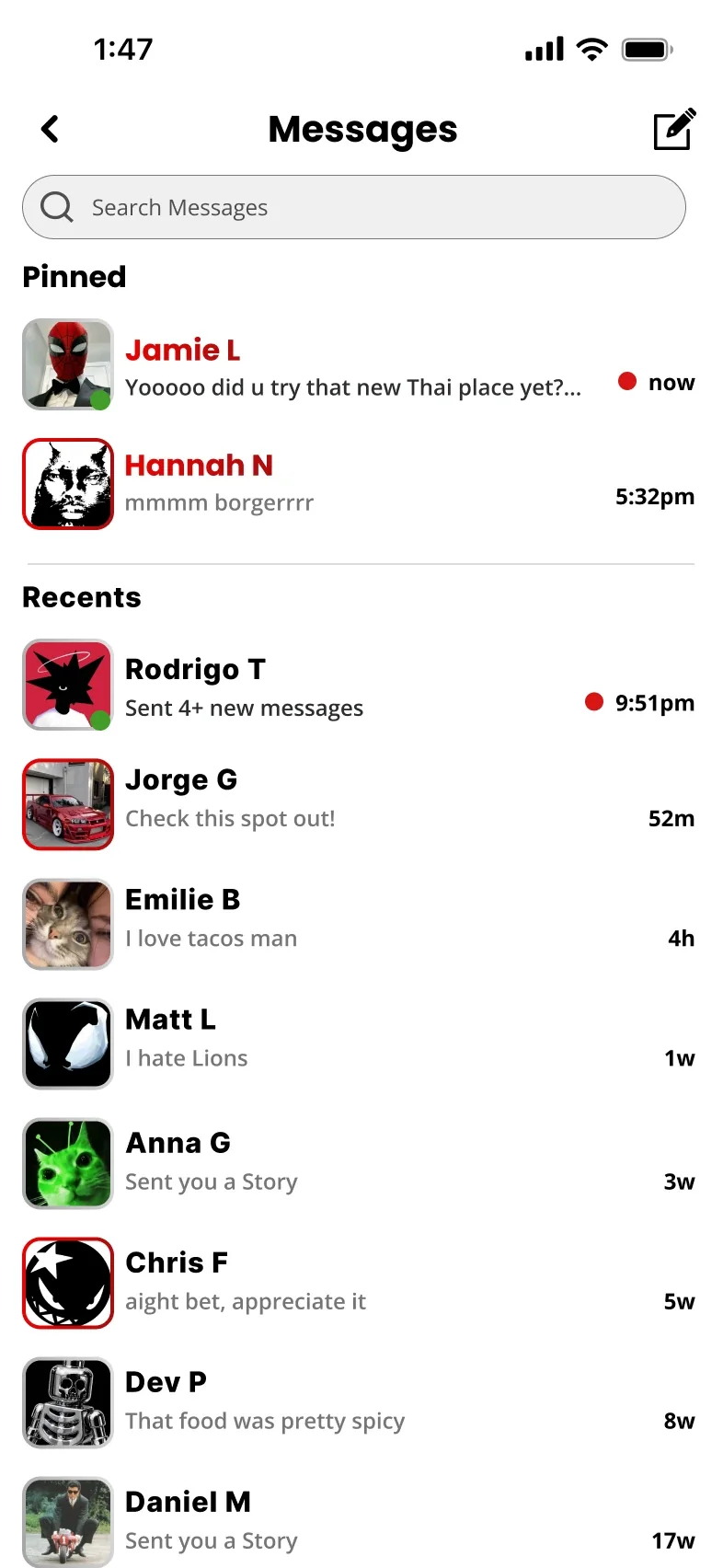
Messages Home My Design
Before: Ads and sponsored posts fill the feed, with little real value.
After: Highlights and featured reviews from people you follow, and messages with friends about where to go next.
-
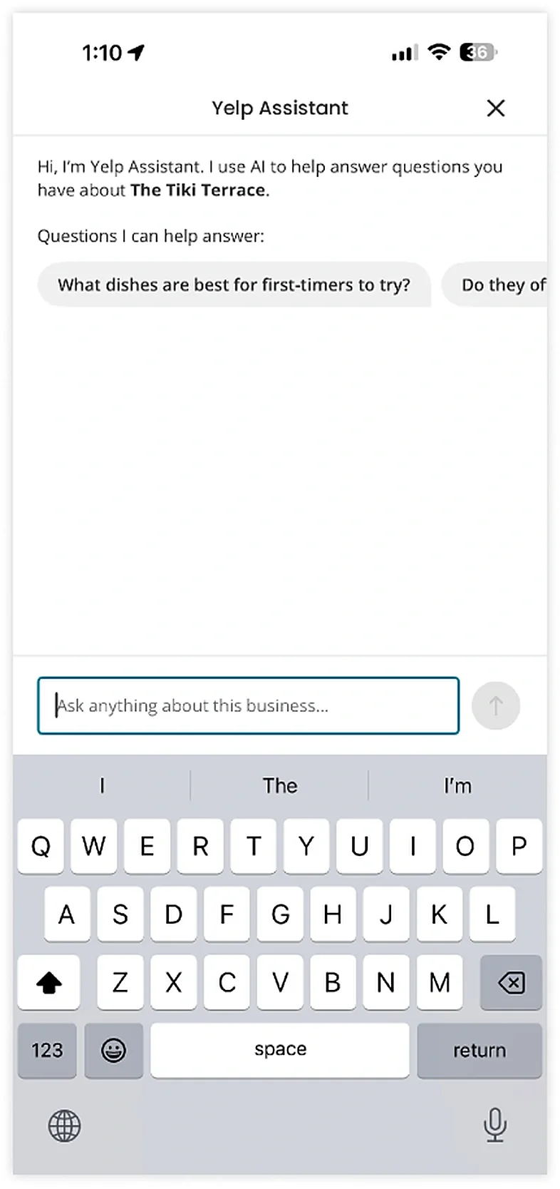
Current 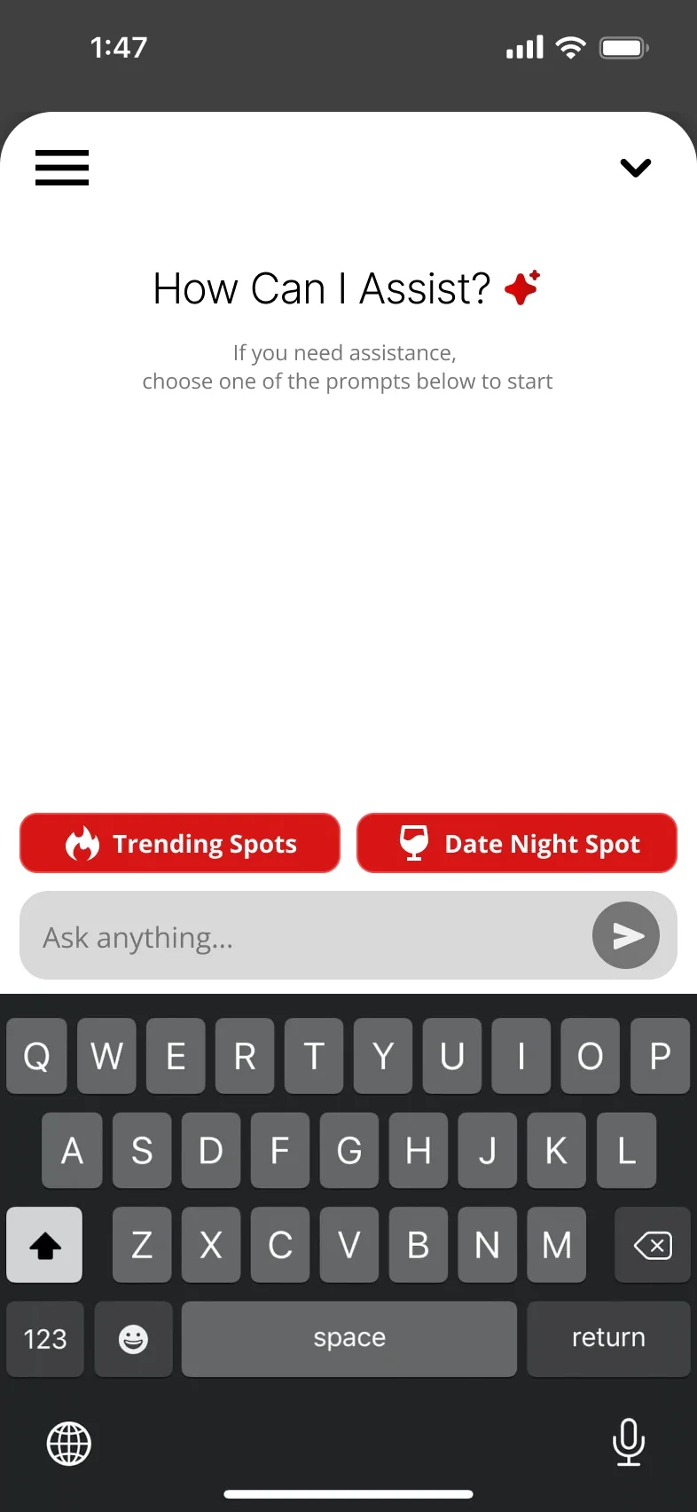
Start 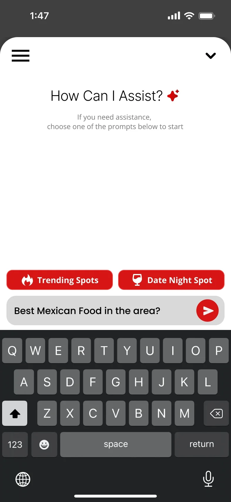
Ask 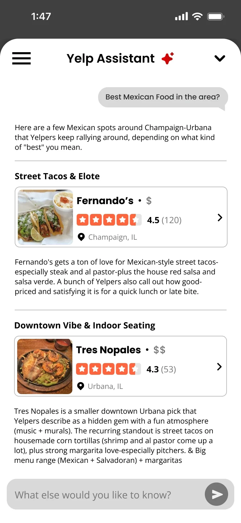
Answer AI Assistant My Design
Before: A plain chat that only answers questions about one business.
After: An assistant for the whole app, with quick prompts like Trending Spots and Date Night, that answers with real places, ratings and short summaries.
-
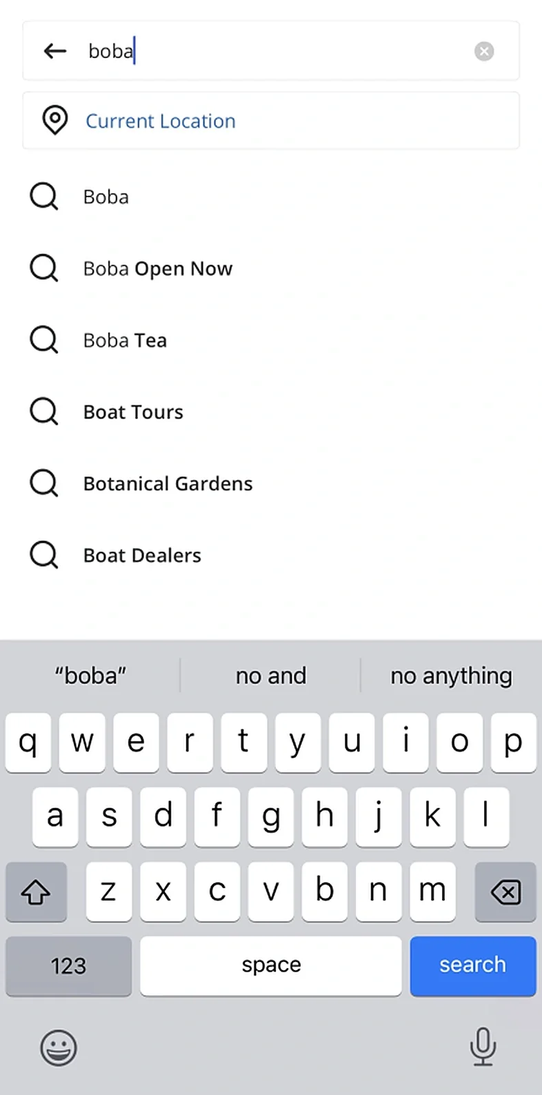
Current 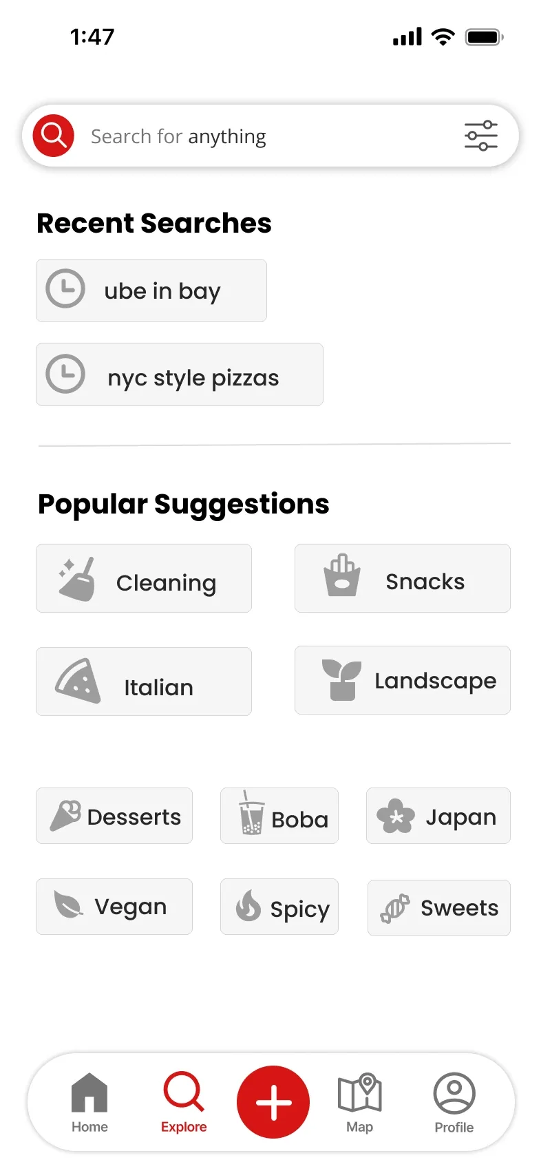
Updated Search 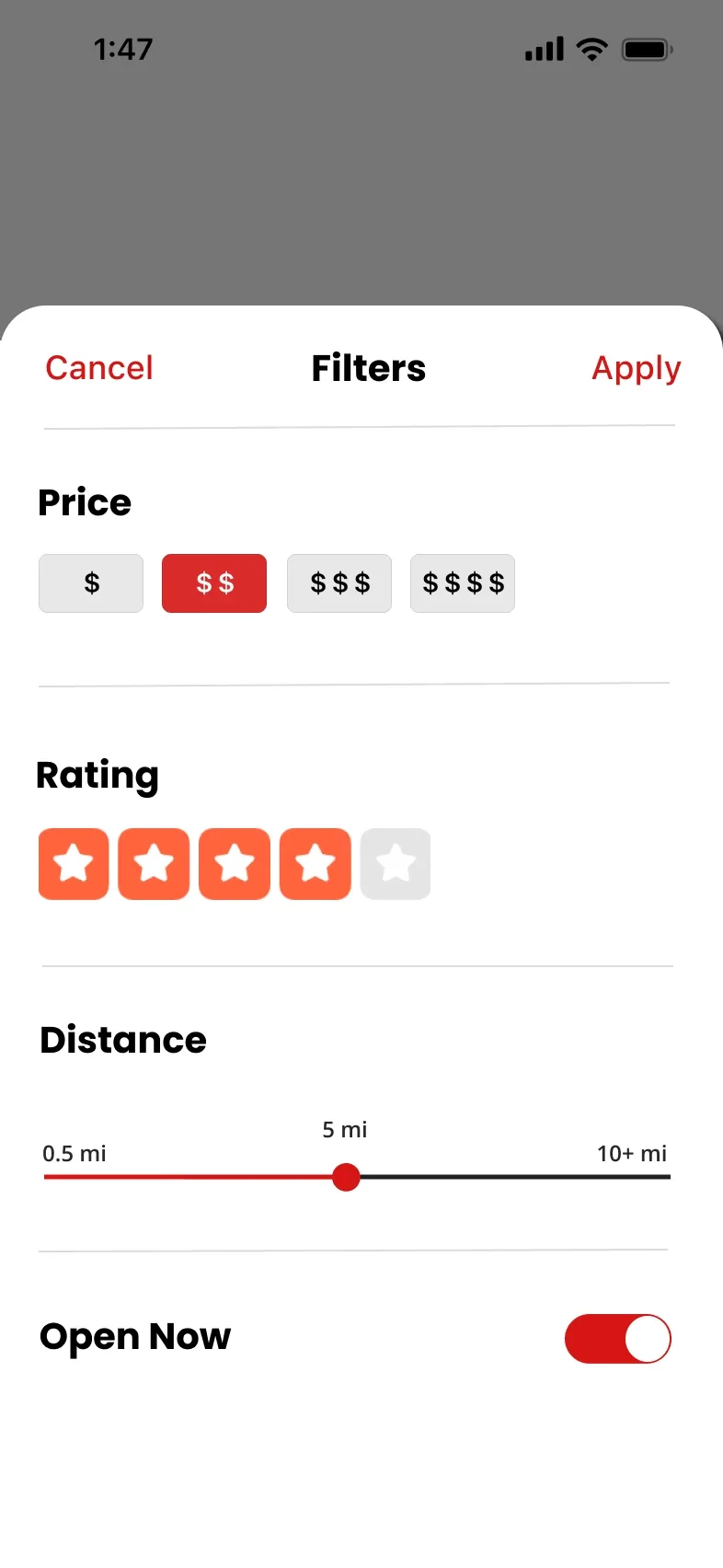
Filters 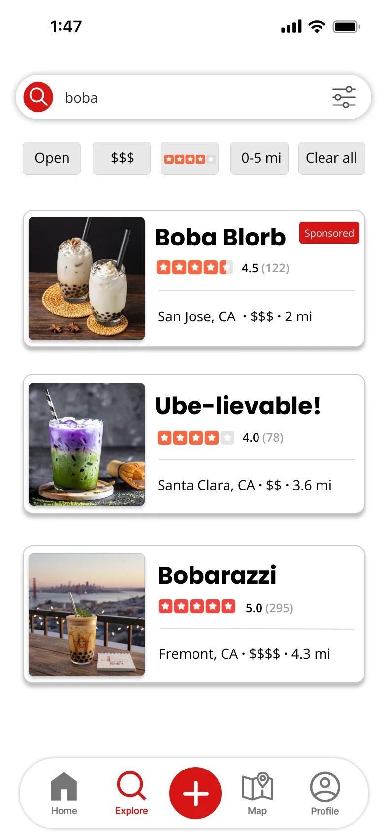
Results Explore
Designed by Jordan
Before: Searching means typing and scrolling a long list of suggestions.
After: Recent and popular searches, quick filters for price, rating, distance and open now, and results that show the deciding details.
-
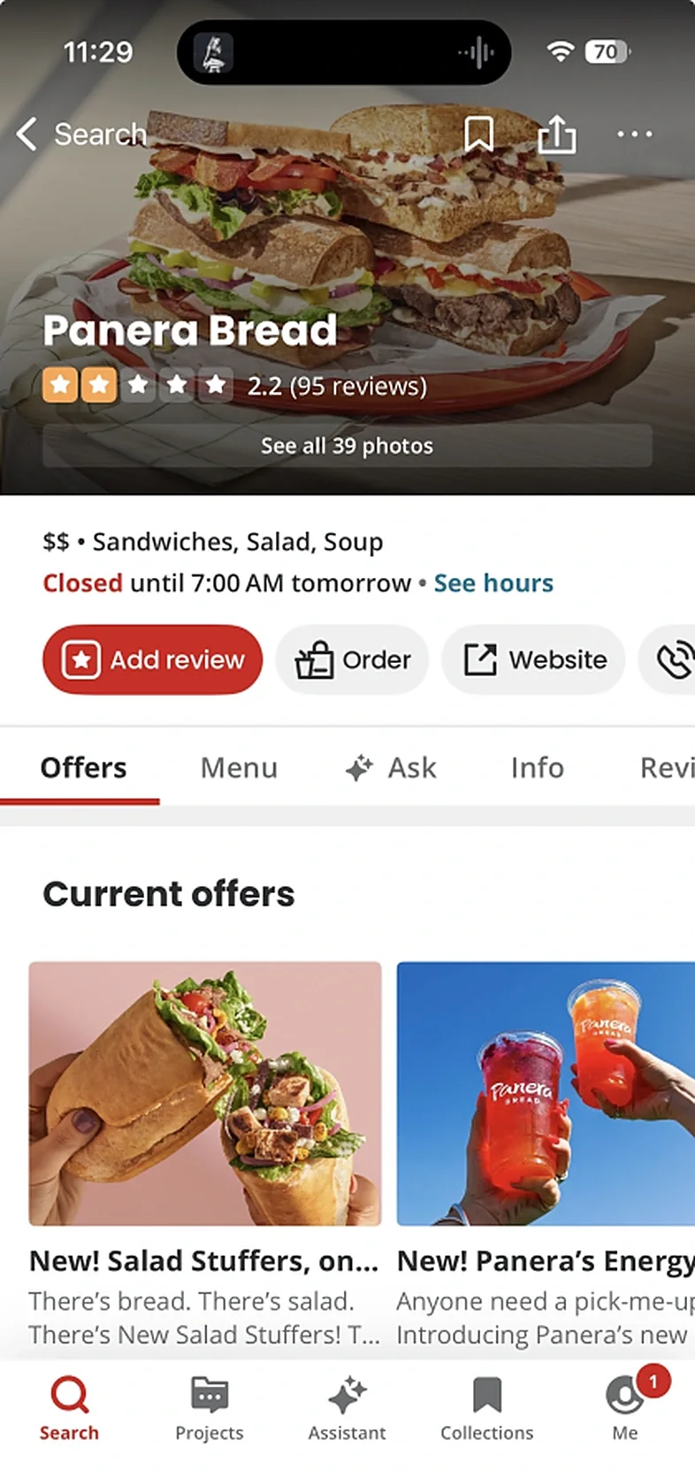
Current
Updated Page 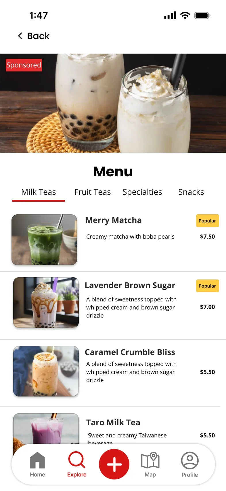
Menu Business Page
Designed by Jordan
Before: Offers, ordering and tabs crowd the page before the reviews.
After: Rating, price and distance up top, then featured dishes, a full menu and customer reviews.
-
Current 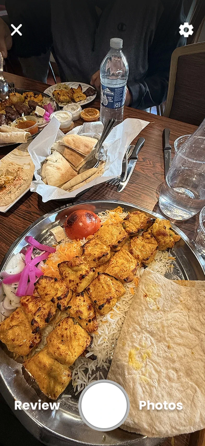
Updated Create Create
Designed by Ryan
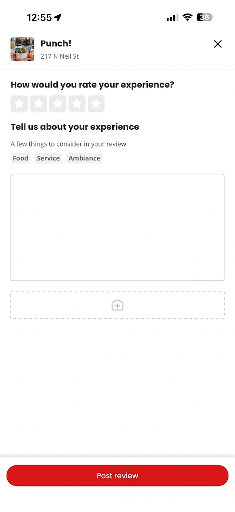
Before: Writing a review starts with a blank form.
After: Start with the camera: snap a photo of the place, then turn it into a review or add it to your photos.
-
Current
Hot Spots 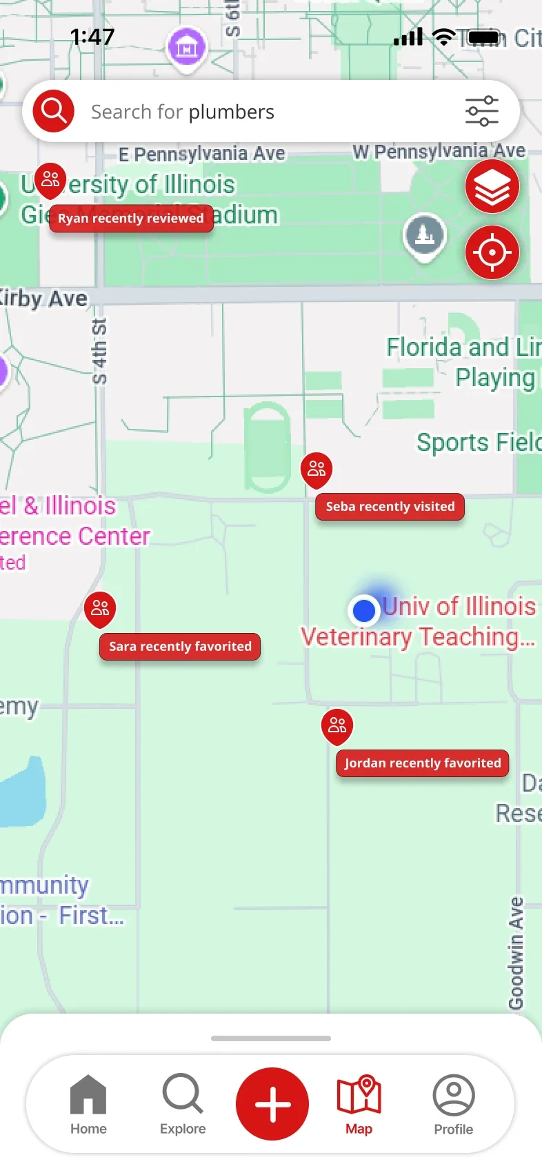
Friends 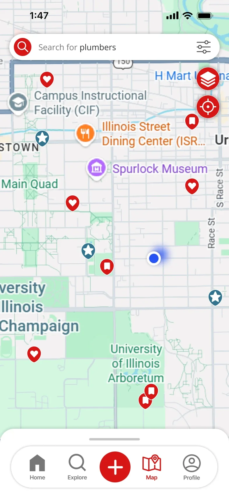
Saved Map
Designed by Sara
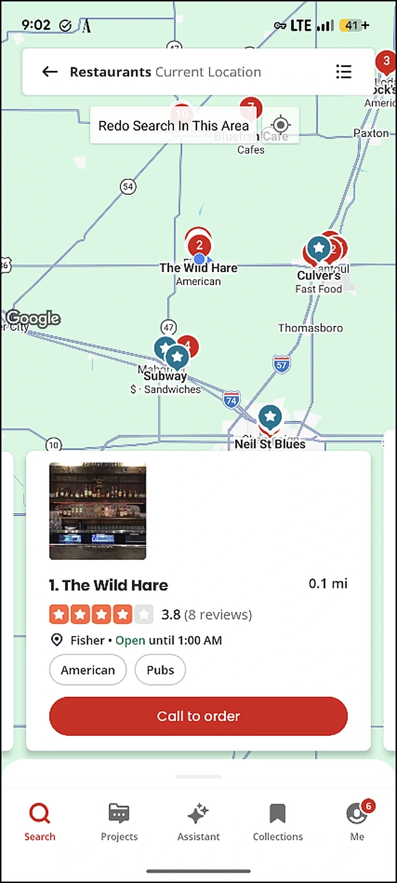
Before: The map only opens after a search, with pins and little else.
After: A map tab you can open anytime, with layers for hot spots, places your friends visited and your saved spots.
-
Current 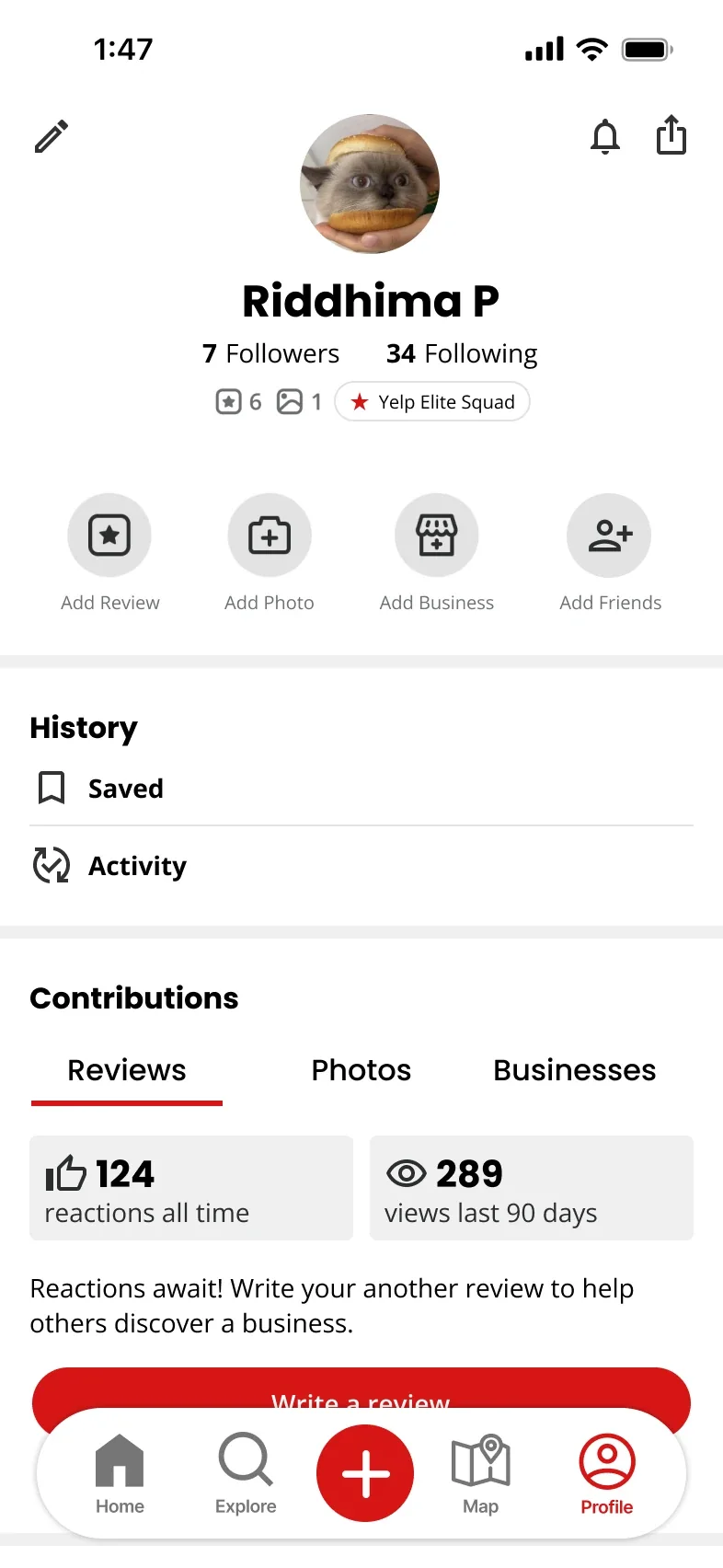
Updated Profile 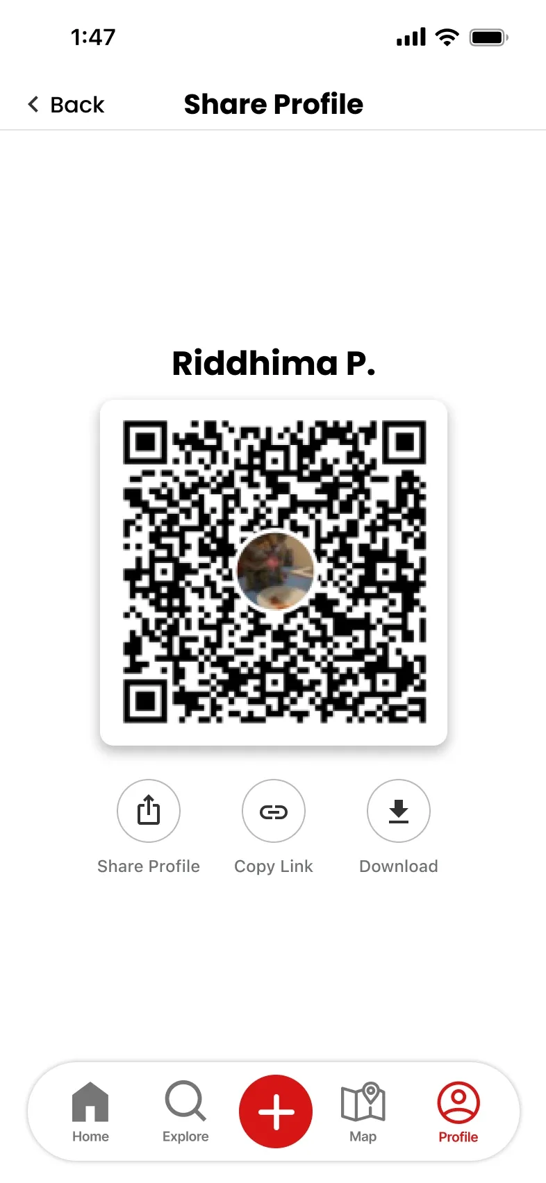
Share Profile 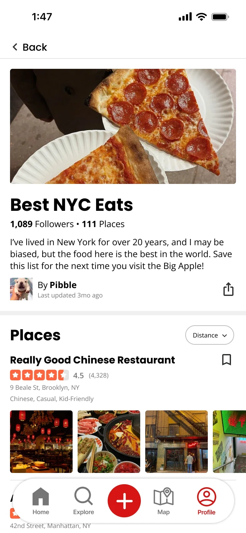
Collections Profile
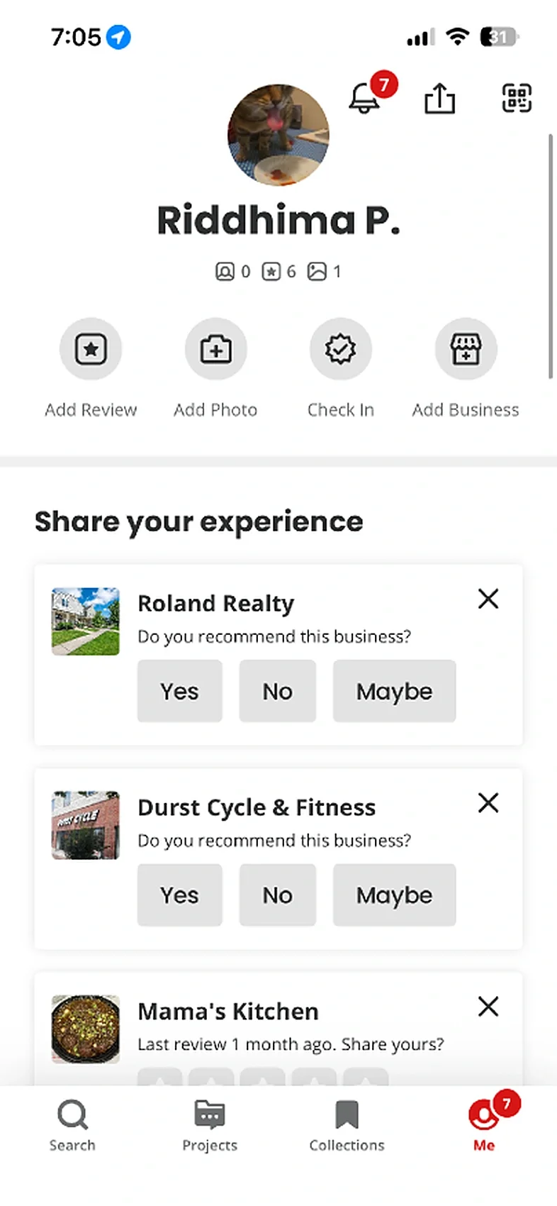
Designed by Riddhima
Before: Contributions, community and settings sit in one long list.
After: History, contributions and settings grouped, a QR code to share your profile, and collections of saved places.
Outcome & Reflection
What Was Delivered
Research with five competitor scores, interviews, four personas and journey maps; a new five-tab structure; mid-fidelity wireframes; an A/B test of the map; and high-fidelity prototype flows for every tab, presented across three checkpoints.
What Comes Next
Test the final flows with Yelp users and measure what the redesign is for: how fast people find a place, and whether highlights from friends make reviews easier to trust.